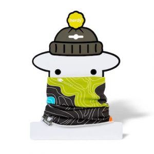
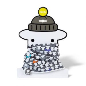
Our new Ewe Tube neck warmers and scarves feature our most adventurous designs yet. As well as the new Flock pattern and Fell style, you’ll have noticed a rather funky design called Contour. This design is inspired by the contour lines used in terrain maps such as those made by the Ordnance Survey.
When the Lake District fells are depicted using contour lines, they develop their own unique patterns. We wanted to celebrate these characteristics.
If you’ve always wondered what all those squiggly lines mean on an OS Map, then read on.
First, a brief history of the Ordnance Survey map
Ordnance Survey Drawings: St. Columb, Cornwall (OSD 7). Provided by the British Library. Licensed OGL v1.0
You may well have already guessed from the name where the Ordnance Survey comes from. The word “ordnance” means “mounted guns” or “artillery”.
The Ordnance Survey was developed for military purposes. Following the Jacobite Rebellion in 1745 the British military desired to map out the Scottish Highlands. Not long after, the French Revolution broke out across the English Channel. As a result the Board of Ordnance wanted to survey England’s vulnerable southern coast. There was an expectation of a French invasion.
The task fell to a young engineer, William Roy, who began a small military survey of Scotland. He started in 1747 and it took him eight years to complete what became known as the Great Map. He produced it at a scale of 1:36000, or 1.75 inches to a mile.
To achieve this Roy used compasses to measure angles and chains up to 50 ft long to measure distances. The rest was “eyeballed” via sketches. Even so this was a momentous feat by someone who was only 21-years old at the time.
Badge of the Royal Army Ordnance Corps. Photo by Gibmetal77, licensed CC-by-SA-3.0
Innovative technology and mapping techniques developed over the following decades. The Ordnance Survey itself formed on 21 June 1791.
By 1801 the first Ordnance Survey map, of the Kent area, was published for public consumption. It took three years to complete, drawn to a scale of two inches for every one mile. At print this became one inch for every mile. It sold for three guineas (that is, three pounds and three shillings). This is about £230 in today’s money!
Four years later the map of Essex was finished and within twenty years about ⅓ of England and Wales had been mapped. The first series of maps for the whole of the UK were published in 1870.
Figuring out contour lines
Elevation lines principle. Licensed under GFDL-1.2
To start, see the illustration of contour lines above.
A contour line connects points of equal height above sea level. If you were to follow the mapped contour line on the land, you would be staying at the same height.
Rather than numbering each individual contour line with its height, maps of 1:25000 scale show a contour line for every five metres of height. In mountainous areas contour lines may represent ten-metre intervals.
But how do you know which way is uphill or downhill from the contour lines? Good question! The numbers on contour lines read uphill; so the top of the number is uphill, the bottom of the number is downhill.
Putting these concepts together, you can see how contour lines “describe” the shape of the land. When the lines are closer together, the slope is steeper. If the lines fan out, the terrain is flatter. From this you can start picking out features such as fells and valleys.
Contour lines work out how steep a slope is, which is useful when planning a hike.
To calculate slope angle:
Understand the map scale, then use a ruler on the map to measure the distance required. Calculate the real distance according to the scale;
Work out the height change by subtracting the lowest contour number from the highest;
Divide the vertical height by the horizontal distance to give steepness.
Rob Farrow / Hardknott Pass from Hardknott Castle (Roman Fort) / CC BY-SA 2.0
For example, you’ve measured on a map a slope where you climb 1 metre in height for every 10 metres of travel. This is (1 ÷ 10) × 100 = 10% slope, also expressed as 1⁄10. You can use degrees as well. If 360 degrees is 100% then 10% is a 36-degree slope.
In general, anything over 15% is tough for cars and bicycles to climb, and over 25% is going to be a challenging hike. With that in mind consider Hardknott Pass in Cumbria from Langdale to Eskdale. Its gradient maxes out at 1⁄3 or 33%, a 118 degree slope!
Hardknott Pass shares the title of “steepest road in the UK” with Rosedale Chimney Bank in North Yorkshire.
Practise reading contour lines
Let’s take some examples.
Above is beautiful Helvellyn. First, it’s easy to see that Helvellyn is much craggier, and steeper, on its eastern side. Its western flank by contrast descends in a gentle way towards Thirlmere. We can tell this without having to look at height numbers or calculating distances. East of Helvellyn’s summit the contour lines are dense, indicating steep drops. To the west the lines fan out as they descend.
It’s easy to confirm by using a tool like Google Earth to get a 3D rendering of the fell.
Contour lines help us to pick out other key features of Helvellyn. It’s easy to see, for example, two of Helvellyn’s famous ridges jutting out northeast from the summit. These are Swirral Edge and Striding Edge.
The steep drop east from the summit to Nethermost Cove is particularly precipitous. The contour lines are compact. By measuring the map and referencing the lines, we can calculate the descent from Lad Crag to Nethermost Cove. It drops around 350 m in 500 m distance. That’s (350 ÷ 500) × 100 = 70%, or an average slope of 252 degrees!
When the contour lines are so condensed you may find other details drawn on the map, such as crag and rock lines. These help to illustrate the terrain better. We can tell, then, that Lad Crag to Nethermost Cove is an extremely steep and craggy wall from the summit.
Let’s move on to the next example: Blencathra, or Saddleback.
Blencathra exhibits a similar profile to Helvellyn, but at a smaller scale. Its eastern and southern faces are steep and craggy, compared to its gentle and smooth western slopes. Like Helvellyn, Blencathra has its own ridges, particularly the infamous Sharp Edge.
Blencathra has its dangers, too. The drop from the summit down to Scales Tarn is vertiginous. From Atkinson Pike to the tarn, follow the bolder contour lines. You’ll see that there is a 245 m drop with only around 300 m distance. That’s (245 ÷ 300) × 100 = an 81.67% slope! The craggy rock lines show that in front of Scales Tarn is a sheer wall of crag.
The slope west from the summit to the sheepfold only drops 378 m in a distance of roughly 1.2 km, a slope of 31.5%.
Another feature that’s easy to see is in the northeast. Here the contour lines space out more and the illustration of a river indicates a valley bottom.
The Google Earth 3D view screenshot below confirms our reading of the map.
That’s the basics of contour lines
Hopefully we’ve just made reading maps, especially from the Ordnance Survey, much easier for ewe! And don't you think that Ordnance Survey maps are just beautiful to look at? We think so, which is why they inspired our Contour Ewe Tube design.
Has this post helped you at all? Do you have unanswered questions? And what do you think of our new Ewe Tube designs? Let's chew the fat in the comments, or join the flock on our Facebook, Twitter, and Instagram. You can also email us, too.
Sign up for our newsletter and you'll automatically be entered into our monthly prize draw, ewe could win £100 worth of Herdy goodies!
Enter your email address
You can change your mind at any time by clicking the unsubscribe link in the footer of any email you receive from us, or by contacting us at hello@herdy.co.uk. We will treat your information with respect. By clicking to Join Us, you agree that we may process your information in accordance with our terms.